What made you say “yes” to this project? What resonated with you personally?
As a logo designer, I am often asked to create designs with symbolic meaning. That happens to be my specialty — giving invisible significance to seemingly familiar icons. However, it’s rare for me to instantly feel a connection with a brand or organization. When the leuKmakers team explained what they stand for and what they want to share with the world, I hesitated for a moment.
To truly grasp the leuK Mark as a consumer, you need to understand what the individual letters and the — so far unfamiliar — operator symbol (.:) represent. Yet, since this involves a completely new concept, I realized it really doesn’t matter how complicated the assignment might seem. The foundation of leuK is extremely simple, and that simplicity makes the leuK Mark easy to read.
I could immediately envision it. That’s why I said “yes” to this project.
What was your first intuitive image or feeling when designing the leuK Mark?
I instantly envisioned a simple and timeless emblem — a “Hero” that could also wear “1000 faces.” Since every person is unique, the leuK Mark can take on a unique form as well. That is where its true power lies: each time you see the leuK Mark, it feels both new and familiar at once.
How did your creative process unfold?
The challenge for me began with designing the new operator. In a world where we primarily communicate visually — think logos, symbols, traffic signs, emojis — we needed to create a symbol that had never been used before. I first explored characters from mathematics and physics, alt codes, and iconography used in electrical schematics.
Next, I searched for inspiration in ancient languages, such as runes (Scandinavia), hieroglyphs (Egypt), Ogham (Ireland), Adinkra (Africa), Maya (Central America), Ayacucho/Quechua (South America), Sanskrit (India), Hebrew and Arabic (Middle East).
Still, my very first idea — the .: — turned out to be the most natural solution.
As for shaping the distinctive “K”, I must admit, that part came together rather quickly. I immediately saw the source within it — unity, expressed by the vertical stroke, which could be read as a “1”. What emerges from that source spreads Karma, symbolized by the < shape. However, that alone felt incomplete — it only told half the story.
To bring the Karma back to the source, another symbol was needed: the curly bracket {. In this way, a unique symbol emerged that expresses both spreading and gathering.
After that, it was simply a matter of selecting the right typeface — one that would avoid any confusion and ensure perfect legibility. The fact that this turned out to be ‘Ubuntu’ seems anything but a coincidence.
What metaphor or image best captures the essence of the leuK Mark for you?
Whenever possible in my work, I draw upon protagonists, places, or events from mythological stories. As I mentioned earlier, the timeless “Hero with a 1000 Faces” — the title of a book by Joseph Campbell — is a wonderful example to me.
You often say that a brand should carry meaning. What, to you, is the core meaning of the leuK Mark?
For me, it is clearly the trinity of seemingly simple letters that together create something greater than the sum or cross-pollination of its parts.
This difference in magnitude is also reflected in the “K”, which rises above and descends below the other letters — a subtle nod to one of the most well-known phrases in Hermetic philosophy: As Above, So Below.
What do you foresee someone feeling or realizing when they truly understand the leuK Mark?
That they need to pause for a moment and make a choice that genuinely serves the interest of everyone involved.
This naturally leads to an expanded awareness, which in turn creates a deeper connection. And isn’t that what we are all ultimately seeking?
When do you think the leuK Mark will have reached its full power?
Let’s refer to Everett Rogers’ Innovation Theory. According to that model, once the early majority has encountered the leuK concept at least once, momentum should start to build. I truly hope that will be the case!
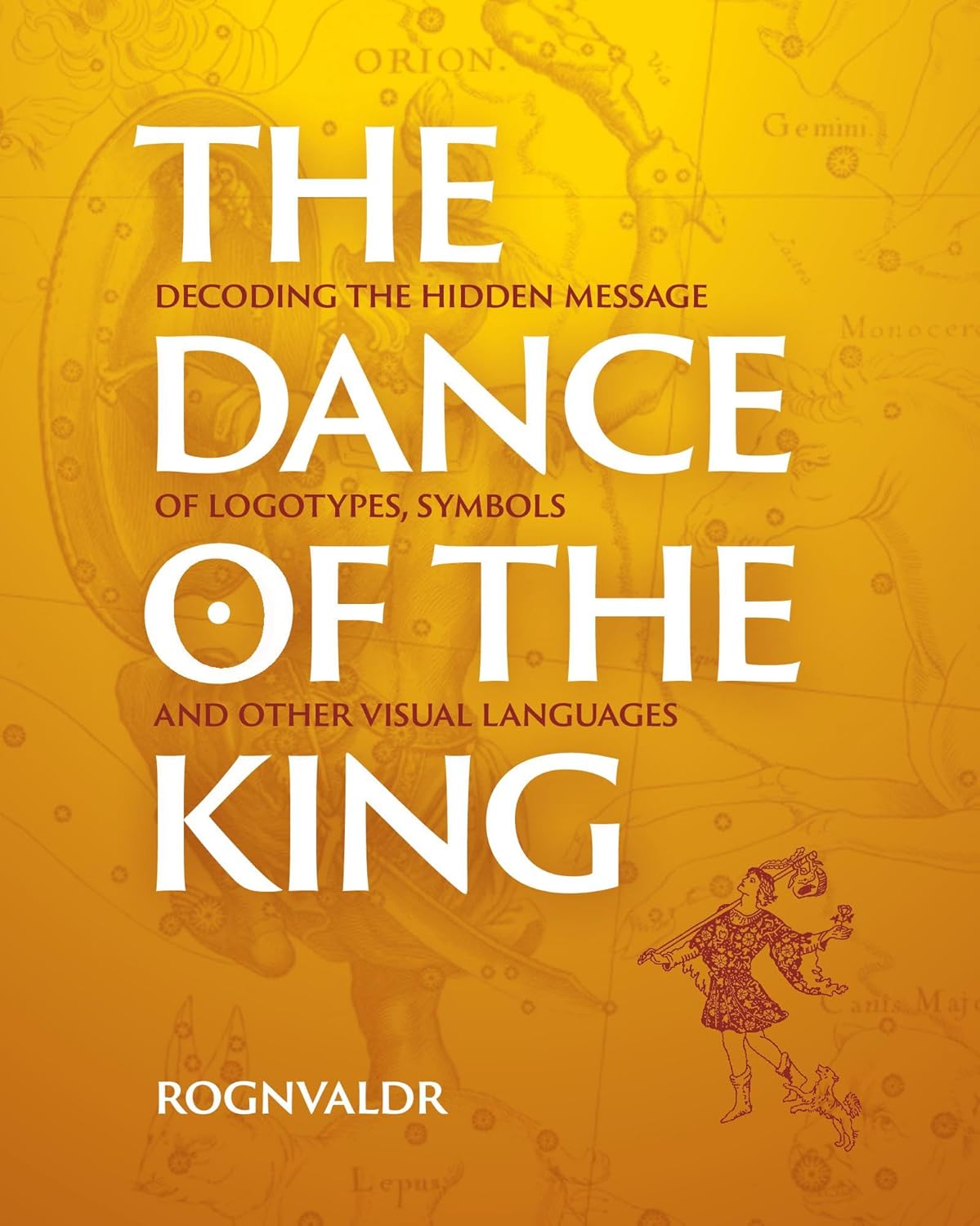
About The Dance of the King
The Dance of the King by Ronald Bos unlocks hidden messages in everyday symbols. From Black Pete and Halloween to Noah’s Ark and corporate logos — everything connects.
The leuK Mark features as one of many examples that blend simplicity with universal meaning. This thought-provoking book offers surprising insights into history, culture, and the mind — forever changing how you view the world.
Now available at major bookstores worldwide, including The Great British Book Shop and Amazon.com.
